The Art of Liner Notes: How Album Packaging Became a Statement in Punk Culture
I was nineteen, standing in a basement in Chicago, and some dude named Marcus was yelling at me because I had designed a flyer for his band featuring a clean sans-serif font. “This isn’t a tech startup,” he said, shove a battered copy of Dead Kennedys’ Fresh Fruit for Rotting Vegetables into my hand. “LOOK AT THIS.”
“LOOK AT IT.” I sat on a beer-soaked couch for an hour looking at it—the collage work, the politics crammed into every spare centimeter, the way Winston Smith’s art made you feel like you were holding something dangerous. That was the night I realized punk packaging wasn’t decoration.
It was the message before the message.
The Xerox Revolution and Why DIY Wasn’t Just About Money
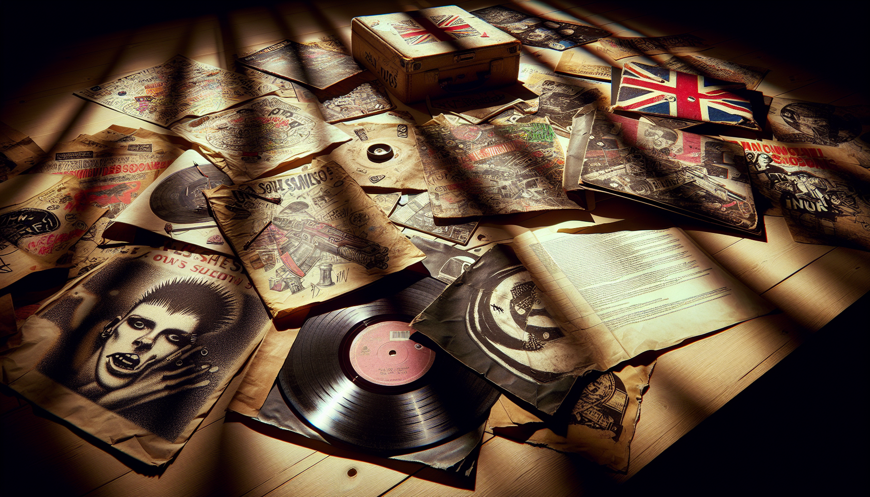
Here’s what most folks get wrong about early punk aesthetics: assume bands used photocopied art and hand-cut lettering because they can’t afford better. And sure, yeah, money was tight, but that explanation completely misses the point, and if you charge less than fifteen dollars for your band to design your packaging now because you’re thinking “It’ll make it look cheap and that’s authentic,” then you’re creating something that appears lazy.
The Xerox aesthetic was a slap in the face to the slick machinery of the record industry; when Jamie Reid designed the ransom-note typography for the Sex Pistols, he wasn’t playing around with cheap thrills, he was referencing détournement, the Situationist International, and slapping the visual nastiness of kidnapping threats and terrorism right on something that would be sold at your local record shop. That’s a manifesto. That’s ideology made visual.
Crass took it further– and frankly, I think their packaging was some of the most ambitious punk has seen, though I’ll admit I know people ready to sue me for saying that. Their fold-out posters, the Penny Rimbaud essays, the way The Feeding of the 5000 came with a whole freaking statement of purpose…they understood that the minute someone picked up your record, the listening experience had already begun. The packaging was the first track.
I’m not entirely sure whether Crass inspired later hardcore bands in a direct lineage way or if it was just something in the zeitgeist, but it was there.
The liner notes as political education
This is what infuriates me about streaming culture – and yeah, I do it, not some purist stuck in 1983 – but we’ve lost the space of the liner notes as a site of radicalization. And I mean that in a good way.
When you picked up a record from Dischord or SST or 8 Ball, you weren’t just getting a bunch of songs. You were getting reading assignments. You were getting addresses for organizations.
You were getting essays connecting the music to labor struggles, to anti-war movements, to animal rights, or to whatever the band actually cared about aside from a 3-chord sequence and the loud bellow. Dischord’s Minor Threat record sleeve contained Ian MacKaye’s own writing on the concepts of straight edge that held entire generations in a certain mindset. The Dead Kennedys included “A Last Will and Testament from the Old World” with Frankenchrist, and yeah, it got Jello Biafra hauled into court over an H.R. Giger poster included, which is a complex issue involving art and obscenity law I won’t get into now. The point: those bands claimed that physical object with every inch covered in information. Every square centimeter was a chance to be saying more than “check out our other records.” If you’re pressing music now and your packaging is an afterthought, then you’re wasting space generations of punks fought to make meaningful.
What actually works (and what I’ve learned the hard way)
Okay, practical stuff, because I promised to be practical and not just nostalgicized.
Number one: match your packaging to your music’s character
This isn’t about aesthetically-matching things in some superficial way, but rather that the physical object continues where the music left off. When I finally began to understand that – years later after that basement lecture – I stopped asking myself “what looks cool” and began asking “what does it feel like to hold this object and does that feel match my music.”
Number two: include something that isn’t music
A zine, a letter, a piece of original artwork, something that gives the physical purchase truly worth the extra time and effort in avoiding streaming. Not as a way to trick people into buying a physical product, but because you honestly have more than 3:00 of music to convey.
Number three: limitations force innovation
Punk packaging looked the way it did in part because of a lack of cash, but that lack of cash inspired a visual style that major label bands can’t copy, even with a hundred grand. If you’re limited in resources, then that is an opening not a curse. It is an opportunity rather than a challenge to making something that seems compellingly human rather than corporate cliché.
One of the biggest things I felt pressure to get right for years was thinking visuals had to be aggressive to have any impact. They really don’t. When I think about Fugazi’s cover art, at least half of the band members released albums contained relatively plain images, but they were still deliberate.
The subject was obvious, the angles and compositions deliberate, and the whole aesthetic was saying no to the record industry’s cleaner designs. That’s the important part. That’s the message.
I have the Dead Kennedy’s record handed to me by Marcus, the edges of the cover worn down by me looking at it, and every time I do this I think about someone taking the time to make something that would alter how I think, and that’s what I want from my work.